
Zeit Case Study
Client: Designlab Student Project
Role: Solo Project Designer
Project Duration: 9 Weeks
-
Company Background
Zeit is a subsidiary of Richard Branson’s Virgin empire. After a long struggle with Elon Musk, Virgin has been able to make time travel tourism available to all.
-
Project Goal
Uncover opportunities for the first ever time travel booking website in order to create a successful brand and responsive website.
Phase 1
Empathize
Competitor Research
While there are no direct competitors to Zeit, I decided it was still important to do competitor research with indirect competitors that were similar to Zeit. I chose websites that also sell unique travel packages, including luxury nature trips and space tourism. This research helped me discover how successful travel companies advertise their trips and help users book their trips.
Competitor Strengths
Many high quality photos
Detailed trip information on tour websites
Strong branding
Clean UI
Competitor Weaknesses
Information about trips not well organized
Lack of trip information on space tourism websites
Difficult to search for trips
User Interviews
-
Particpant Demographics
I conducted 3 interviews with participants ages 30-50 from the US, who have experience booking trips online and travel frequently.
-
Research Goal
Learn what current travelers value when booking trips, so I could understand would would encourage users to book trips with Zeit.
User Interview Insights
-
Main criteria for choosing a trip is word of mouth and unique points of interest.
-
Appreciate detailed information about trips.
-
Most important information are photos, clear pricing, location and amenities.
-
Appreciate when there are multiple ways to filter and organize search results.
-
Value experiences with experts and reviews of experts.
User Persona
I created a user persona to have a clear user in mind to help make decisions throughout the rest of my project. This user persona came directly from the insights I received from my user interviews. Specifically her goals, frustrations, and motivations are very similar to my user interview participants.

Phase 2
Define
Card Sorting
Based on my research it seemed clear that users like to have lots of information about trips they are looking at, as well information about the company itself. They also like to have multiple ways to filter and search for trips. Because of this, I decided to create a fairly in depth site map. I wanted to make sure this site map would make sense to users, so I conducted a card sorting to get users feedback on the draft of my site map.

Site Map
I created a final site map directly based on the results of the card sorting. The big difference between the site map before the card sort and the one after is that I added a sixth category called “General Trip Information” because there were a few cards that users were confused about where to put and one user even suggested adding this additional category to help with the confusion.

Phase 3
Ideate
Task Flow
I decided to focus on designing for the task of a user booking a trip, since this is the main flow for the Zeit website. Creating this task flow helped me to figure out every page and interaction that I would need to design in order for a user to successfully book a trip with Zeit. I tried to keep the process as simple as possible and similar to other online booking processes so it is easy and familiar to users.

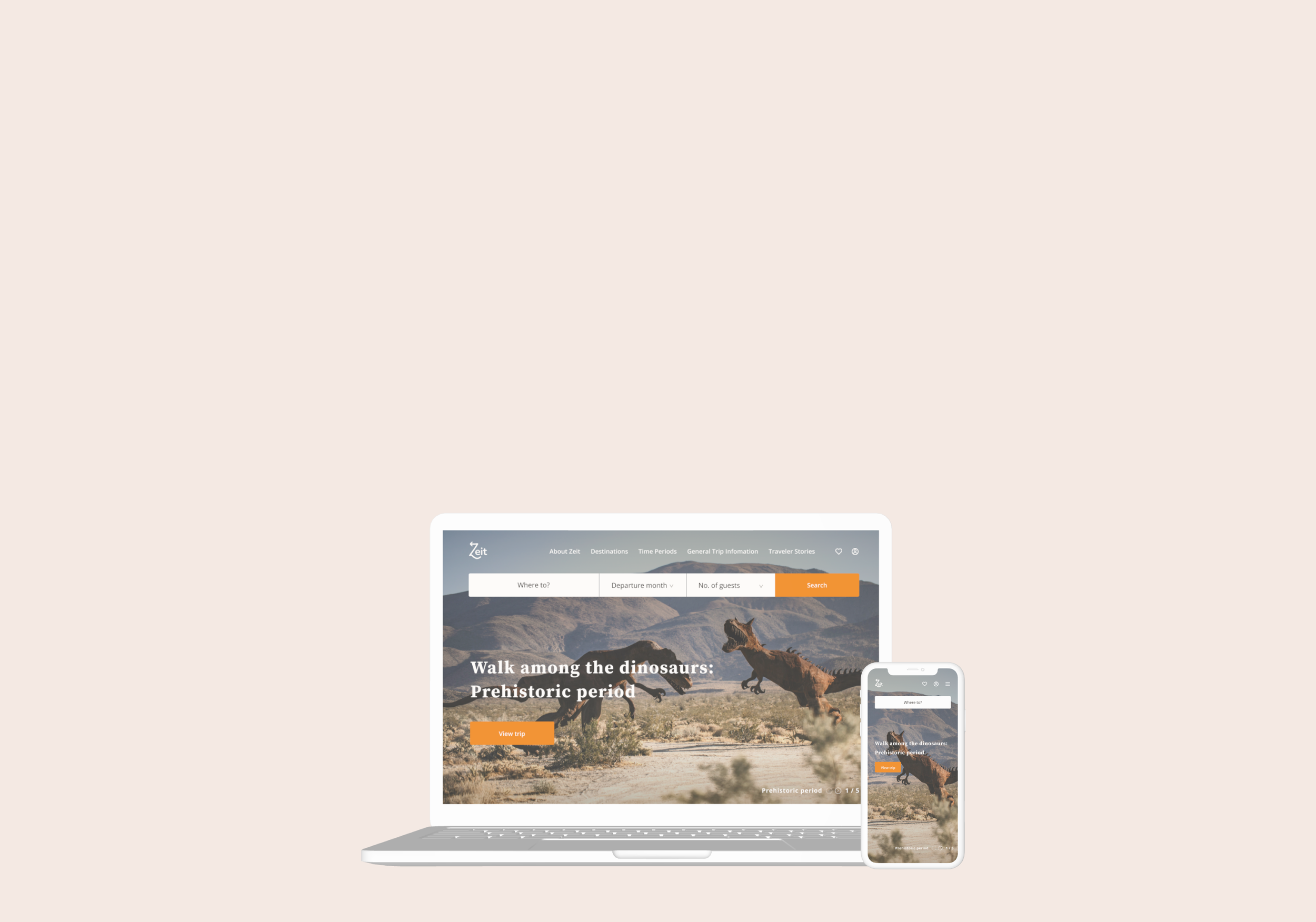
Responsive Wireframes
I designed wireframes of the Zeit homepage for Desktop, Tablet and, iPhone screens. I also designed all the main screens for Desktop. I used all my insights and results from competitor research, user research and card sorting to influence my wireframe designs.
Wireframe Design Priorities
-
Clear navigation and information architecture so site is easy for users to navigate.
-
Multiple ways to search and browse trips so it is easy for users to find and compare trips.
-
High quality images that get users excited about trips.
-
Information about the company and trips so users feel confident booking a trip.
-
User reviews and photos so users can feel more secure booking a trip.

High Fidelity Responsive Designs
I created high fidelity responsive designs of a homepage for both Desktop and iPhone screens. I also designed all the main screens for Desktop.
UI Design Priorities
-
High quality bright images to be the main focus of the design to get users excited about the trips.
-
Light and clean design that is modern and deluxe feeling so users feel confident booking trips.
-
Some hints of color and typography that feel adventurous and exciting so users are excited about the trips.

Phase 4
Prototype
High Fidelity Prototype
I created a desktop prototype using my high fidelity desktop designs with every screen and interaction for the task of booking a trip.

Phase 5
Testing
Usability Testing
I created an online usability test to see how users would interact with my prototype. I had 3 participants who all shared the same demographics as my interview participants.
-
Goal
See if users are able to easily interact and complete tasks with prototype, in order to iterate on the prototype.
-
Tasks Tested
Navigate from Home page to Trips Result Page.
Find 6-8 Day long Europe Trips.
Find and book a specific trip.
Priority Revisions
From my usability testing it was clear that there were 2 major issues users were experiences. I decided that these were my highest priority revisions and to make these changes to my prototype:
Users wanted to be able to use the search bar to find trips on the home page.
Users were struggling to filter and find trips on the search results page.

Conclusions
While it did feel challenging when I first started this project to design a website for a brand new concept, I believe I made the right decision by focusing on what was familiar about this concept: online travel booking. I think this helped me design a website that would feel familiar and comfortable to users even though time travel is a new concept.
If I did have more time and resources for this project, one thing I would’ve wanted to do is more usability testing. Specifically, in person/via zoom usability testing. While I did receive valuable feedback from my online usability testing, I do feel like I could’ve received more feedback if I had the opportunity to actually talk one on one to test participants.
My next steps for this project would be more usability testing and making some more revisions to my designs. Then I would begin to design other task flows and website pages.