
Sapphic LA Case Study
Mobile website redesign for finding Sapphic-specific events in Los Angeles.

Project Type: Capstone for Northwestern Graduate Program
Role: Solo UX Designer
Deliverables: Problem Statement, Research Insights, User Journey Map, Competitive Analysis, Low-Fidelity Wireframes
Tools: FigJam & Figma
-
Problem
Despite Sapphic LA's reach and resources, many members of the Sapphic community in LA still feel they lack access to Sapphic-specific events, spaces, and communities that interest them.
-
Solution
Based on my research and problem statement, I decided to redesign Sapphic LA’s website to allow users to easily search, find, filter, and register for Sapphic-specific events.
User Interviews
I interviewed 5 participants in 30-minute sessions conducted via Zoom. In these interviews, I asked the participants questions about their experiences, needs, values, and desires around finding Sapphic community in LA. The demographics of my interview participants were queer women and nonbinary individuals who currently reside in Los Angeles County and are between the ages of 20 and 40. These are the insights I gained from my user interviews:
While each participant has some experience with either having Sapphic friends or attending Sapphic events, they all have a desire to engage more with the community.
All research participants believe that being involved with the Sapphic community is important to them. Primarily because it allows them to connect with a community that has similar experiences and understanding.
Participants face several challenges when trying to engage with the Sapphic community. These include finding genuine friendships, geographical inaccessibility of events, and finding events catered to their age group and interests.
The most common way participants search for community is online. Instagram is the most commonly used platform for finding events. Participants either follow specific accounts promoting events or conduct general searches.
User Journey Map
To determine how to effectively apply the key insights from my research to redesign the Sapphic LA mobile website, I developed a User Journey Map. This map outlines four main steps in a potential user's journey while using the redesigned mobile website to find Sapphic events in Los Angeles.
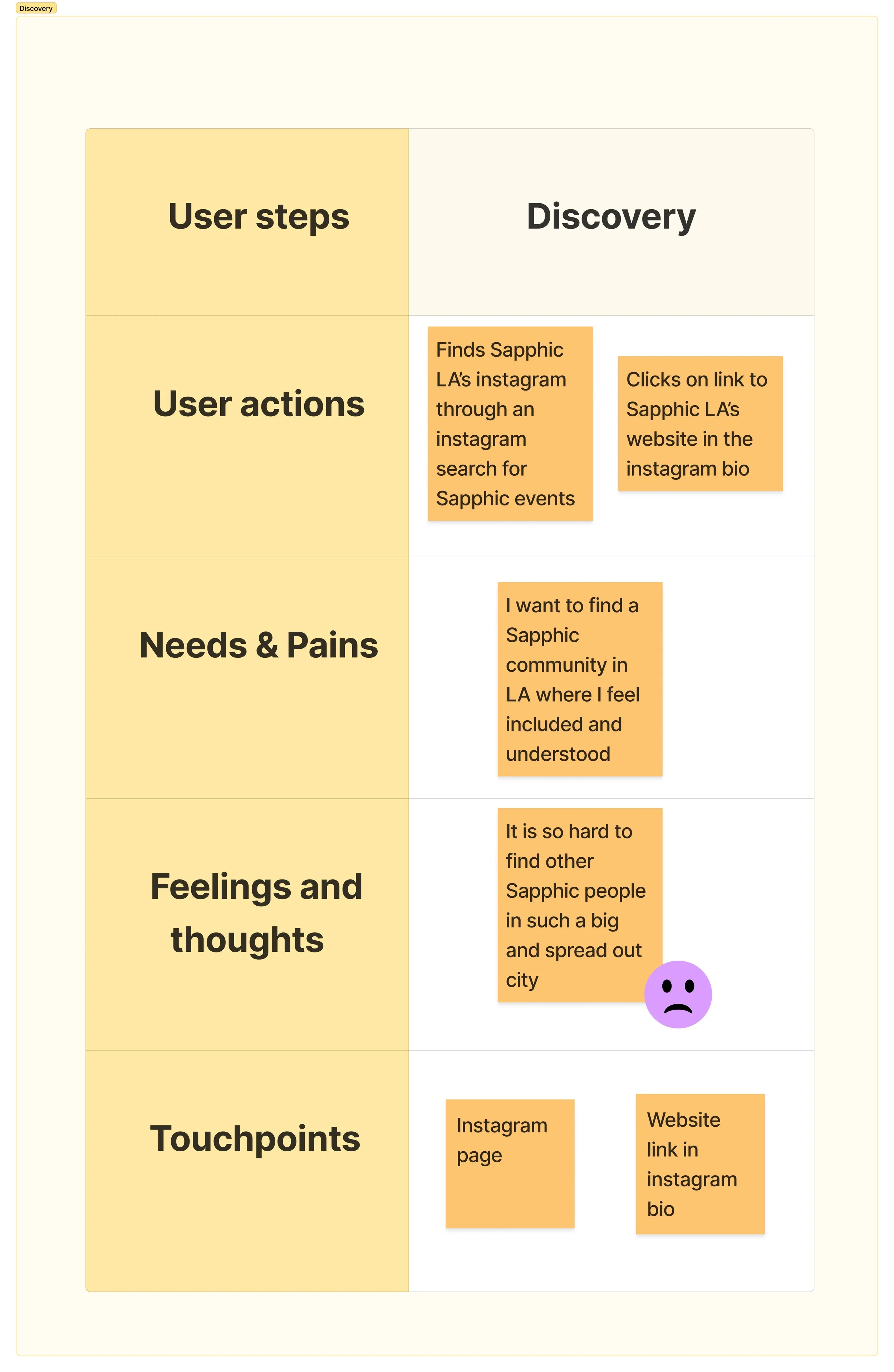
Step 1: Discovery
In this phase, the user discovers the mobile website through Sapphic LA's Instagram page. This step addresses their need to find a platform where they can connect with a local Sapphic community, fostering a sense of inclusion and understanding.
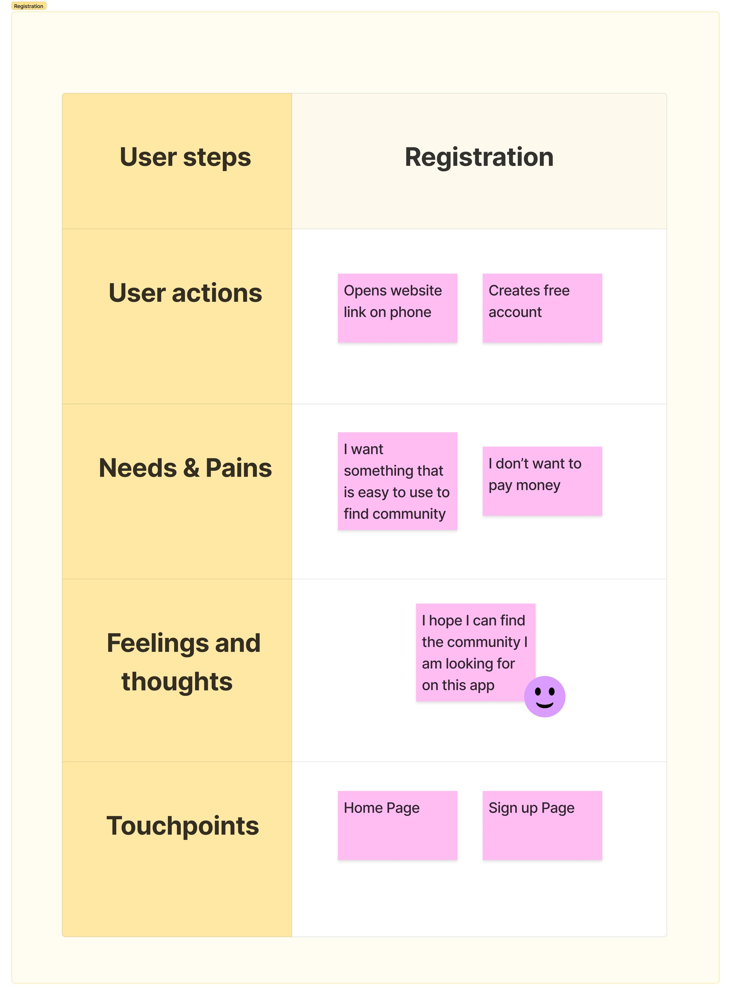
Step 2: Registration
Here, the user opens the website on their phone and signs up for a free account. This simple step is aimed at building the user’s confidence and reassurance, confirming that they have found a platform that will help them connect with the community they seek.
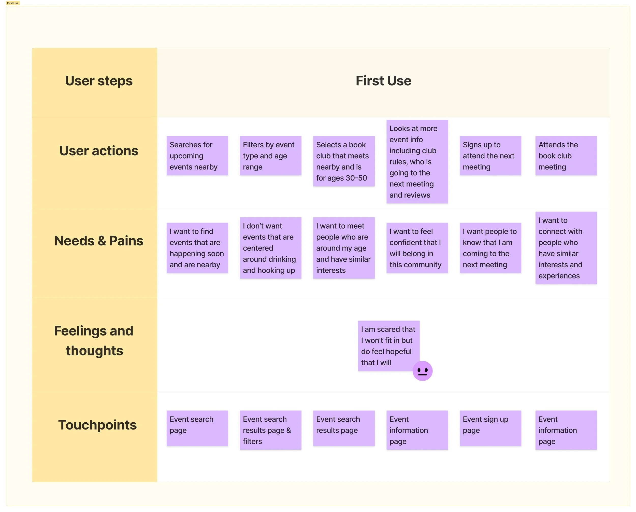
Step 3: First Use
This is where the user searches for upcoming events nearby, filters these events based on their preferences, selects an event that meets their needs, and finds the relevant information to ensure the event is appropriate for them.
This is a crucial part of the user’s journey because it is essential for addressing several major user needs, including the desire to find nearby events happening soon, meet people of similar age and interests, and feel confident about belonging to the community.
Because this step in the user journey is so crucial, I decided to focus the majority of my design efforts on this step.
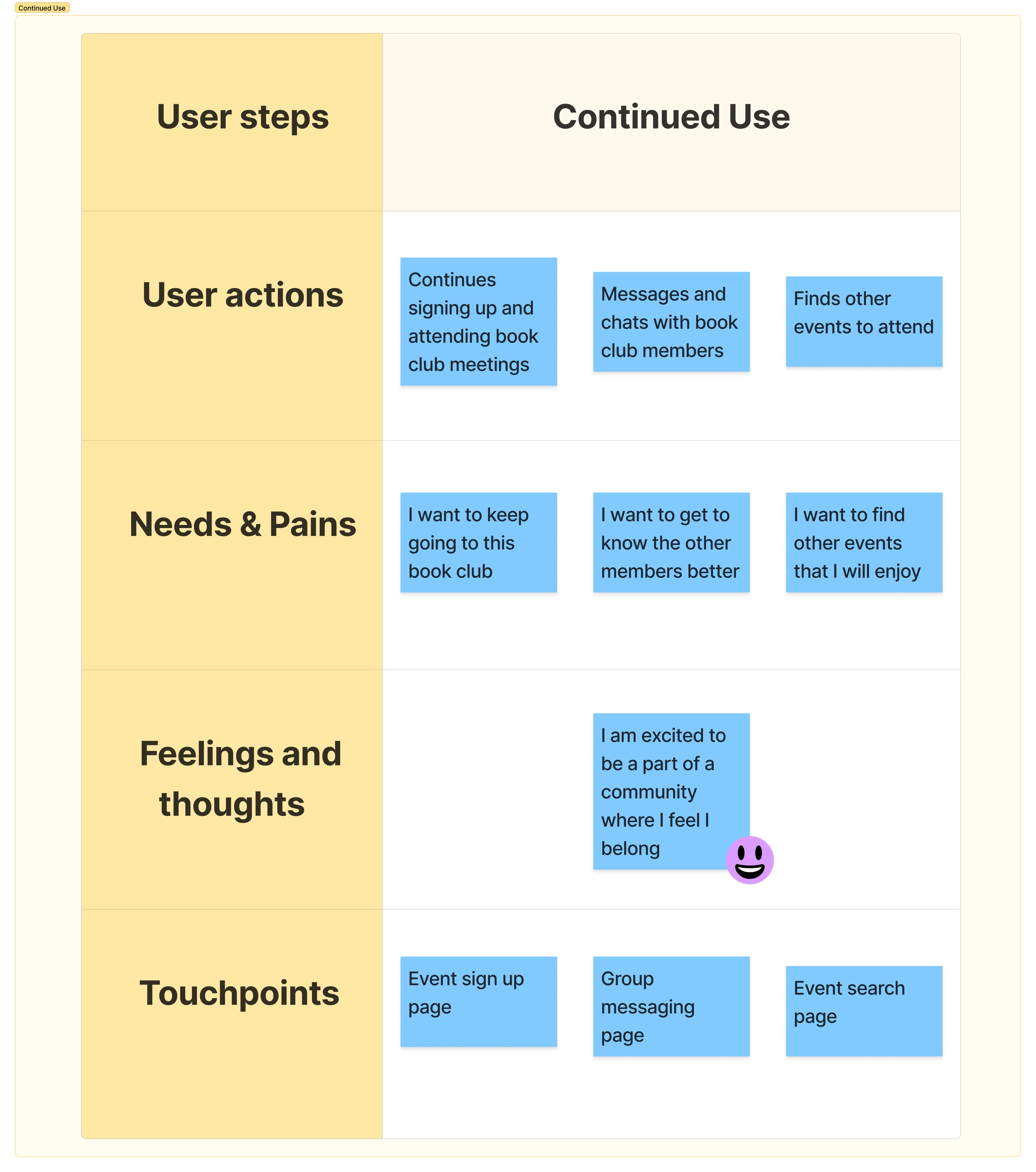
Step 4: Continued Use
The final step in the user journey is when the user continues to engage with the website to register for events, chat with other attendees, and discover new events. This phase addresses users' needs to feel like active members of the community through connections with others and ongoing participation in events.
Competitive Analysis
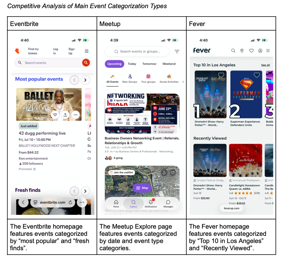
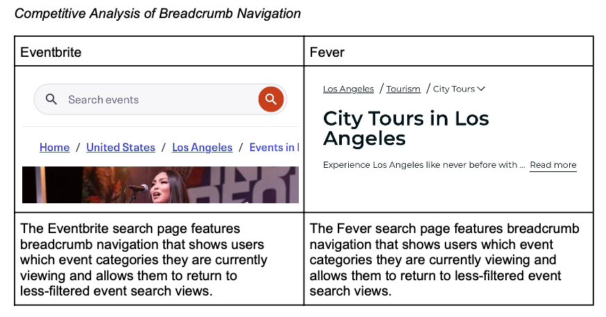
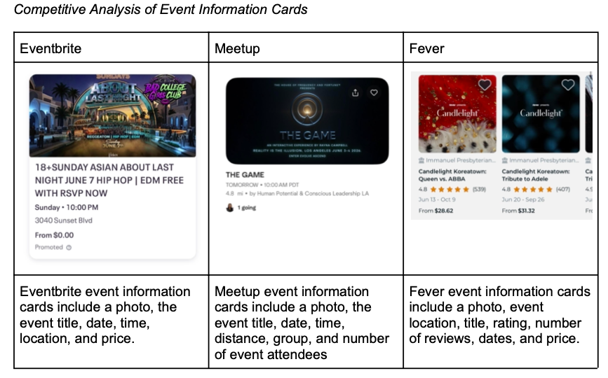
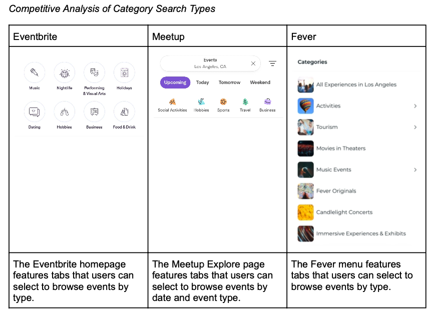
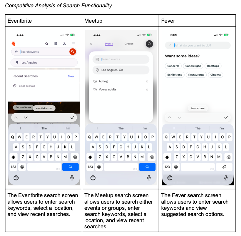
Once I had an overall idea of how the website redesign would address users’ problems, I decided to explore existing websites to see how they tackle similar issues. For this competitive analysis, I compared specific features of each platform to identify elements I might want to include or exclude from my website redesign. I also aimed to gain a better understanding of the features and design elements commonly employed by similar platforms.
Low-Fidelity Wireframes
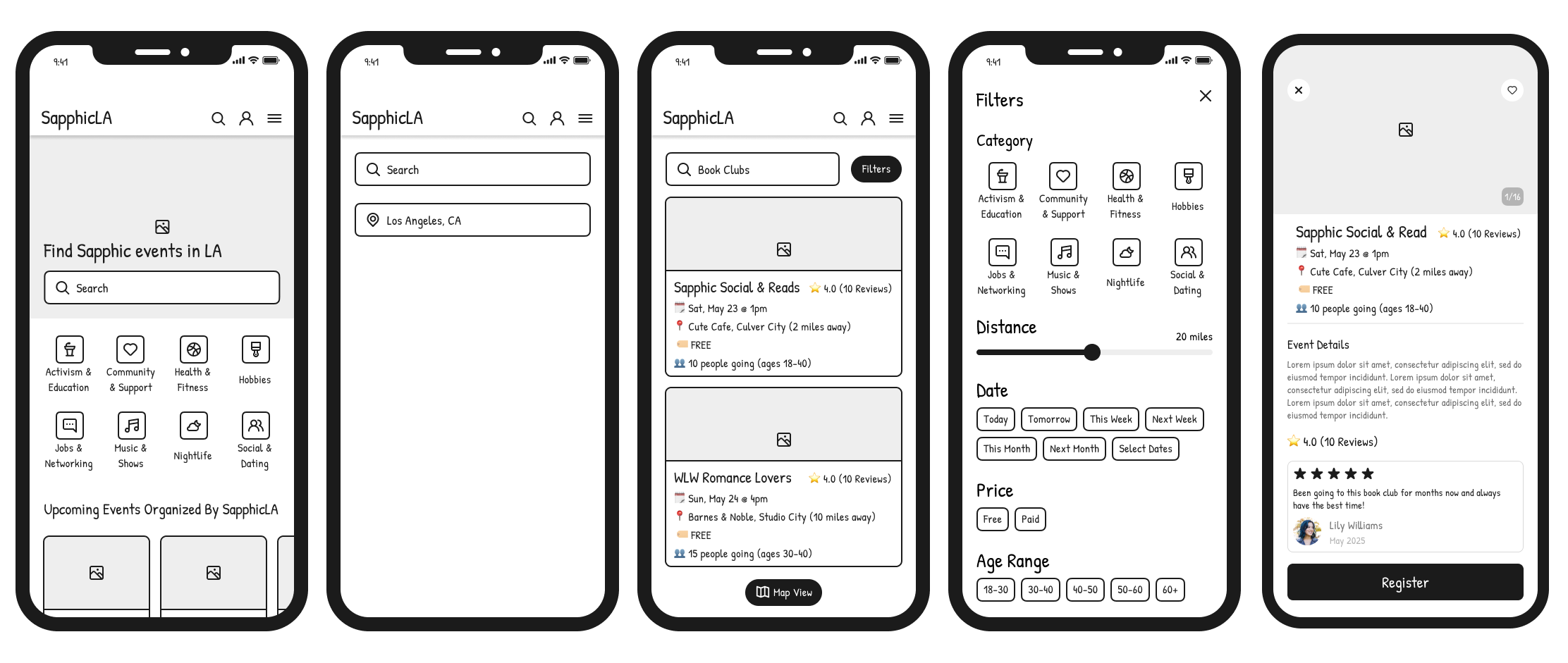
Once I had an overall idea of the user's journey using the redesigned website and my insights from the competitive analysis, I decided to create low-fidelity wireframes in Figma that showcase the main screens and steps the user would take, specifically to find and register for an event.
Event Search Wireframes
The event search feature enables users to find events by either selecting an event category on the home page or entering a search term and location on the search page. Users can also filter events based on event category, distance, date, price, and age range. By clicking on an event, users can view the full event details and register for an event.
Event Registration Wireframes
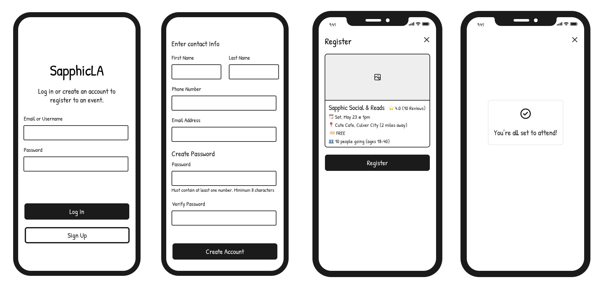
Once a user decides to register for an event by clicking the register button, they will be taken to a login/sign-up screen to either log into an existing website account or create a new account. After the user has logged into their account or created an account, they will be able to confirm their registration for the event.
Reflection
One of my biggest takeaways from working on this project was how much I have learned throughout my grad school program. I felt I could incorporate much of what I learned from my other classes into my capstone project, often revisiting previous assignments to remind myself of my work throughout the program and to see how I had approached similar projects in the past. It’s both satisfying and exciting to see how much I was able to integrate into my capstone project, and I am confident I will carry this knowledge into future roles in user experience design.
One of the most challenging parts of this project, which also led to significant breakthroughs, was focusing on the "why" behind my actions and prioritizing the process over the end product. Initially, I wanted my final deliverable for my capstone project to be a high-fidelity prototype. However, as the project progressed, I realized the importance of those earlier deliverables. As a result, my final deliverable became low-fidelity wireframes. Though they may not be as visually appealing or polished as a high-fidelity prototype, I worked very hard on them, ensuring every element was intentionally included.
If I had more time to work on this project, the next step would be to conduct a usability test to receive feedback from actual users on these wireframes. I would then take this feedback and utilize it to further refine and make changes to the wireframes. Next, I would reach out to Sapphic LA with the hopes of showing them my wireframes and collaborating with them on this project. If Sapphic LA is interested in my wireframes and my website design, then I would design a high-fidelity prototype that could ideally be used by a developer to actually code and create the website.