
Kindred Case Study
End-to-end mobile app design for finding and developing genuine friendships.
Project Type: Concept for UX Design Bootcamp
Role: Solo Product Designer
Deliverables: Research Insights, User Persona, Product Roadmap, Low & High Fidelity Wireframes, Prototype
Tools: Figma, Microsoft Excel
-
Problem
Young adults are struggling to make and maintain authentic and meaningful friendships.
-
Solution
Design a mobile app that helps users find genuine friendship connections and helps support and encourage these connections.
Competitive Research
I conducted competitive research to gain insights into the features and solutions of our competitors. Identifying 5 of my direct competitors was the first step. Then I went through their apps and created a list of design strengths and weaknesses for each competitor. This research helped me come up with some features and design ideas that would help position my product above the competitors.
Competitor Strengths
Easy to find friends through app matching or swiping through profiles.
User profiles feature a decent amount of interesting and helpful information.
Ability to chat, call or video chat through the app.
Competitor Weaknesses
Not a lot of support to help develop connections once users match.
Profile information tends to be more cursory and superficial.
Many users do not remain active on the apps or are unresponsive.
User Interviews
During the ideation phase of the project, I conducted user interviews to build new personas and to inform the design. I prepared an interview script with 24 open-ended questions, focusing on my target audiences’ values and motivations when looking to make genuine friendship connections. I recruited and interviewed 5 users remotely. I referenced the user interview findings throughout the entire design process. Here were some of the main insights I gained from the interviews:
It is important for users to find friends with similar interests and values.
Being able to be vulnerable and feel comfortable with friends is very important to users.
Users find that good communication is key to a meaningful friendship.
Users have found that people on friendship apps tend not to be very responsive and it is hard to get past small talk.
User Persona
I wanted to form a deeper understanding of my users' goals, needs, experiences, and behaviors. So, I created a persona based on my user interviews. I used this persona whenever I wanted to step out of myself and reconsider my initial ideas.

Product Roadmap
I created a prioritized spreadsheet of website features based directly on my competitor research and user interviews. I used the User Story Structure to make sure I knew why these features would specifically help my users. This spreadsheet helped me form an organized and prioritized list of features that would be necessary to include in my designs and other features that I might want to include in the future.

Wireframes
Using Figma, I created low-fidelity wireframes with arrows showing the flow between each screen. Here were my main design priorities when creating these wireframs:
Clear navigation and information architecture so the site is easy for users to navigate.
Focus on profile information so users can get a good idea of who their matches are and if they want to get to know them.
Incentives for users to chat, make plans and get to know their matches so users are more likely to develop connections with their matches.
Assistance with chatting and making plans with matches, so it is easy for users to get to know their matches.

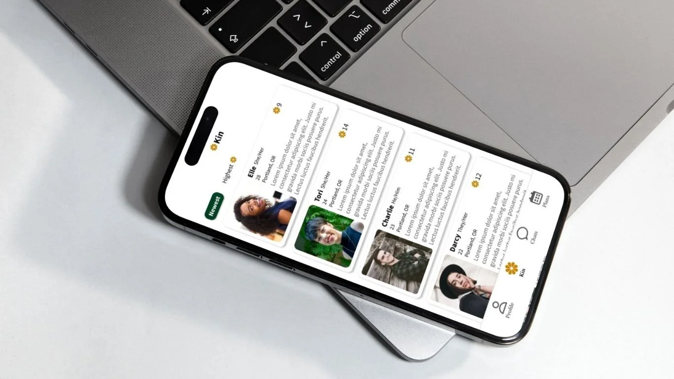
UI Design
Once I finished my wireframes, I moved on to design the final screens in Figma. I designed screens for mobile. My goal was to create a visual identity that’s aligned with the brand’s values and message. Here were my main design priorities when creating these UI Designs:
Simple, clean and modern so it appeals to young adults.
Slight natural and vintage touches to showcase that the goal of the app is to create real and genuine connections.

Usability Testing
I created a fully-functional, high-fidelity prototype using Figma. I then recruited 3 usability testing participants and conducted in person tests, where I had participants sit next to me and I watched how they interacted with my prototype. From my usability testing it was clear that there were 3 major issues users were experiencing:
Users thought some of the information on the Kin Profile could be prioritized differently.
Users did not recognize the calendar icon.
Users struggled with a few of the interactions.
I then made changes to my designs to address the issues users faced during testing.

Conclusions
This project made me realize more than ever how important research is. Specifically the user interviews really helped me learn about how people make friends and how I could create an app that could really help make this process easier for users.
One of the biggest challenges with this project was figuring out how to help users connect once they are matched on the app. There are already existing apps that do a good job of helping users find potential friends but the big issue seems to be what happens after that. It took a lot of brainstorming to come up with ideas that I felt could really help ease the process of getting to know people.
Something I would’ve done differently with this project is spent more time on the wireframes. I think I felt a little rushed because I was worried that branding and UI design would take a while and so I didn’t spend as much time as maybe I could’ve on the wireframes.